The board needs an icon
-
Jolsen
- Joined a 1100cc Club
- Posts: 5574
- Joined: Tue Sep 16, 2014 12:34 pm
- My Bike: ZG-XII and VS-XIV
- Moniker: Postmaster
- Location: North Pole
Re: The board needs an icon
ddog link me to where you got your eagles. I will do a cleaned up version of your original idea and both of the new ideas when I get home tonight
VS1400 Wiring Diagram INFOWARS
Its not my job to prove myself every time I state facts. Its YOUR job to look it up and find out what I say is true.
-
ddog6900
- Joined a 250cc Club
- Posts: 621
- Joined: Sat Sep 20, 2014 4:14 pm
Re: The board needs an icon
Do you one better, I'll just post it.Jolsen wrote:ddog link me to where you got your eagles. I will do a cleaned up version of your original idea and both of the new ideas when I get home tonight

-
ddog6900
- Joined a 250cc Club
- Posts: 621
- Joined: Sat Sep 20, 2014 4:14 pm
Re: The board needs an icon
Here's what tc posted, only with the font larger. Not the exact same font, but closest I can find. Edited the S from the original.
-
YoDude
- Joined a 1200cc Club
- Posts: 11021
- Joined: Sun Sep 07, 2014 5:30 am
- My Bike: Suzi 1400
- Location: San Somewhere. West Coast
- Contact:
Re: The board needs an icon
Not to highjack the thread, but I tried to do a mass email to all the current members to come see what we're doing with this. Anyone get it? I think it probably didn't work.
Yo-
Yo-
Intelligence is just the right thing to have, to render yourself extinct.
-
ddog6900
- Joined a 250cc Club
- Posts: 621
- Joined: Sat Sep 20, 2014 4:14 pm
Re: The board needs an icon
Nope.YoDude9999 wrote:Not to highjack the thread, but I tried to do a mass email to all the current members to come see what we're doing with this. Anyone get it? I think it probably didn't work.
Yo-
-
tc1400
- Got My M1 License!
- Posts: 430
- Joined: Tue Sep 16, 2014 7:00 pm
- Location: Wesley Chapel, Fl.
Re: The board needs an icon
One more revision with minor fixes (best I can do with graphic tools I have). Not to step on anyone's toes, but just to compare different font types so we can finalize a cleaned up version.
Larger original font, shadow removed under bike, tried to clean up the cropping under the bikes tires (sort of). Again, just a draft. The eagles should be replaced with a clean one.

Larger original font, shadow removed under bike, tried to clean up the cropping under the bikes tires (sort of). Again, just a draft. The eagles should be replaced with a clean one.
-
MadCow
- Site Admin
- Posts: 6303
- Joined: Thu Sep 18, 2014 1:36 pm
- My Bike: 2023 Pan America Special
Re: The board needs an icon
Send a PM to the group "Registered Users"...YoDude9999 wrote:Not to highjack the thread, but I tried to do a mass email to all the current members to come see what we're doing with this. Anyone get it? I think it probably didn't work.
Yo-
-DBTO
-
YoDude
- Joined a 1200cc Club
- Posts: 11021
- Joined: Sun Sep 07, 2014 5:30 am
- My Bike: Suzi 1400
- Location: San Somewhere. West Coast
- Contact:
Re: The board needs an icon
That's what I did, or so I thought anyway. Okay, I'll try it again, thanks for the feedback.MadCow wrote:Send a PM to the group "Registered Users"...YoDude9999 wrote:Not to highjack the thread, but I tried to do a mass email to all the current members to come see what we're doing with this. Anyone get it? I think it probably didn't work.
Yo-
Carry on.
Yo-
Intelligence is just the right thing to have, to render yourself extinct.
-
ddog6900
- Joined a 250cc Club
- Posts: 621
- Joined: Sat Sep 20, 2014 4:14 pm
Re: The board needs an icon
That's as clean as the eagle gets, when you remove the Suzuki. When I place it in the smaller image, it distorts. Not really much I can do about that, other than change formats, which my phone won't do. We'll see what Jolsen does with it. But I agree, no engine solo. Looks too much like the original IA logo. All you'd need is the circle.tc1400 wrote:One more revision with minor fixes (best I can do with graphic tools I have). Not to step on anyone's toes, but just to compare different font types so we can finalize a cleaned up version.
Larger original font, shadow removed under bike, tried to clean up the cropping under the bikes tires (sort of). Again, just a draft. The eagles should be replaced with a clean one.
-
tc1400
- Got My M1 License!
- Posts: 430
- Joined: Tue Sep 16, 2014 7:00 pm
- Location: Wesley Chapel, Fl.
Re: The board needs an icon
I tried a flood fill on zoomed in version and didn't turn out just right.
-
ddog6900
- Joined a 250cc Club
- Posts: 621
- Joined: Sat Sep 20, 2014 4:14 pm
Re: The board needs an icon
Just so I know, this is the basic design everyone likes. I'm up for minor changes. Font, size, alignment, etc. I know football is on, but I'm checking in during commercials.
-
ddog6900
- Joined a 250cc Club
- Posts: 621
- Joined: Sat Sep 20, 2014 4:14 pm
Re: The board needs an icon
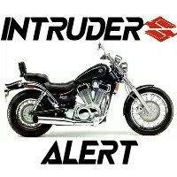
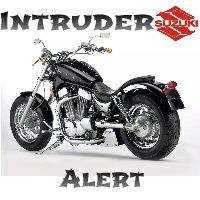
Due to lack of feedback, I get bored. I'm just playing now. Large shogun style font, larger Suzuki logo w/ Suzuki left in the logo and large Intruder chopper instead of something generic.
-
Dude
- Site Admin
- Posts: 81
- Joined: Sun Sep 07, 2014 2:06 am
- My Bike: Susuki VS1400
Re: The board needs an icon
YoDude9999 wrote:That's what I did, or so I thought anyway. Okay, I'll try it again, thanks for the feedback.MadCow wrote:Send a PM to the group "Registered Users"...YoDude9999 wrote:Not to highjack the thread, but I tried to do a mass email to all the current members to come see what we're doing with this. Anyone get it? I think it probably didn't work.
Yo-
Carry on.
Yo-
Okay, I think it worked that time LOL
-Dude
-
BRONX INTRUDER
- Joined a 850cc Club
- Posts: 1437
- Joined: Sat Sep 27, 2014 9:00 pm
- My Bike: vs1400
- Location: Clearfield, PA
Re: The board needs an icon
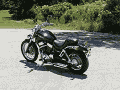
lmao!.. Wife said that one looks like it has a flat tire in the back. lol.JFL Live wrote:Here you go... No charge! :thumbup:


-
YoDude
- Joined a 1200cc Club
- Posts: 11021
- Joined: Sun Sep 07, 2014 5:30 am
- My Bike: Suzi 1400
- Location: San Somewhere. West Coast
- Contact:
Re: The board needs an icon
It's definitely a classic!
Yo-
Yo-
Intelligence is just the right thing to have, to render yourself extinct.
-
BRONX INTRUDER
- Joined a 850cc Club
- Posts: 1437
- Joined: Sat Sep 27, 2014 9:00 pm
- My Bike: vs1400
- Location: Clearfield, PA
Re: The board needs an icon
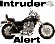
Two closest I like. I like the font on the top one but like the layout on the bottom one. Stock bike and Eagle S are definite go's on it though.

-
PCC

- Joined a 650cc Club
- Posts: 1252
- Joined: Wed Sep 17, 2014 7:34 am
- My Bike: GW TRIKE + 1300 Yamaha V Star
- Location: Sourthern MO
Re: The board needs an icon
ddog6900 wrote:Due to lack of feedback, I get bored. I'm just playing now. Large shogun style font, larger Suzuki logo w/ Suzuki left in the logo and large Intruder chopper instead of something generic.
Hey I like that... looks bad ass. :thumbup:
However, I good with whatever you guys come up with.
Read My Daily Musings On Numerous Topics
Especially Riding Motorcycles & Camera Captures
Of My Meanderings...
https://pcove99.wixsite.com/website
Especially Riding Motorcycles & Camera Captures
Of My Meanderings...
https://pcove99.wixsite.com/website
-
tc1400
- Got My M1 License!
- Posts: 430
- Joined: Tue Sep 16, 2014 7:00 pm
- Location: Wesley Chapel, Fl.
Re: The board needs an icon
This bike is so cool. Love to do this to mine but I ride too much for that type of seat.ddog6900 wrote:Due to lack of feedback, I get bored. I'm just playing now. Large shogun style font, larger Suzuki logo w/ Suzuki left in the logo and large Intruder chopper instead of something generic.
-
RoadKing
- Joined a 1100cc Club
- Posts: 6577
- Joined: Fri Sep 19, 2014 7:27 pm
- My Bike: Road King
Re: The board needs an icon
Hello. Now, there are folks here who I have a certain amount of affection for even if we never have met, folks who I nonetheless would like to meet, so I don't want any of you to get offended by my reply. OK? But, ya see, I never even rode an Intruder nor owned one, so I think it would be ingenuous of me to vote on an Intruder icon, it would seem like silly pandering. I have ridden with Intruder folks but it had nothing to do with their brand, but only that they are riders. I love the world of two wheels.
Here is where I need your understanding. Were I to choose an icon for this or any other site it would be a picture of me riding my Road King and flipping the bird at the viewer! :big grin:


Here is where I need your understanding. Were I to choose an icon for this or any other site it would be a picture of me riding my Road King and flipping the bird at the viewer! :big grin:
“Life’s but a walking shadow, a poor player, that struts and frets his hour upon the stage, and then is heard no more.
It is a tale told by an idiot, full of sound and fury…
Signifying nothing”
Signifying monkey, stay up in your tree. Always lying and signifying, but you better not monkey with me.
It is a tale told by an idiot, full of sound and fury…
Signifying nothing”
Signifying monkey, stay up in your tree. Always lying and signifying, but you better not monkey with me.
-
tc1400
- Got My M1 License!
- Posts: 430
- Joined: Tue Sep 16, 2014 7:00 pm
- Location: Wesley Chapel, Fl.
Re: The board needs an icon
ddog, do this one up again, but with no gradient in the font. Full black. Leave everything else.ddog6900 wrote:Due to lack of feedback, I get bored. I'm just playing now. Large shogun style font, larger Suzuki logo w/ Suzuki left in the logo and large Intruder chopper instead of something generic.